Showing posts with label Business. Show all posts

Tuesday, June 16, 2015

On Design Language Systems 01: IBM

One of my key professional activities is writing and designing brand guidance systems for companies and organisations. It has been a pillar of my practise for over twenty years. So I have spent a lot of time thinking about how to help people understand their organisation’s visual identity systems, use them effectively, improve them logically, and extend them thoughtfully.

Spread from Manuals One. ©Unit Editions.

As a corporate design aficionado, I have enjoyed spending many evenings pouring over esoteric design details in my copies of Unit Editions’ handsome publications Manuals One and Manuals Two. These two books, reproducing a rich selection of corporate design and identity guidelines from 1963 through to 2008, are an unrivalled design reference resource.
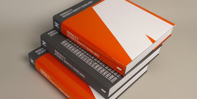
Cover of Manuals Two. ©Unit Editions.

However, examining the requirements of corporate design from the sixties and seventies inevitably got me thinking about the differences in how organisations use design today. At the simplest level, the underlying principles of corporate design still stand; while many of the various technologies of production, manufacture, and distribution have altered significantly, evolved, or have been replaced completely. At the more profound level, it is the ways that companies operate, organise themselves, deliver their services, and communicate with their customers, that have all changed most fundamentally in the last fifty years.

So it is worth asking whether the existing forms of design and brand guidance have kept pace with the ever-changing nature of the commercial entities which are their subject matter.

That line of thinking eventually leads one to enquire: what should designers strive to give as the most useful design guidance for the ever-increasing scope of digital expressions which are central to all experiences delivered by today’s organisations? While organisations will always require some form of brand guidance, I no longer think that itself is sufficient any more. I believe that the most interesting organisations today are having to evolve a more valuable approach of also defining their overall design experience frameworks. These frameworks are more all-encompassing than traditional brand guidance systems.

Four Design Language Examples

I think it is worth investigating some examples of the novel kind of design experience frameworks that I have in mind. These four organisations have each addressed different aspects of the overall corporate challenges to be expressed by design. They form a useful basis for study as they have made much of their design experience framework systems available online. These four sites are all rich in information and each is well worth delving into.

— IBM Design Language
To establish a unified digital experience across many digital products delivered by one global organisation.

— Google Material Design Framework
Towards a consistent digital user experience across many digital products delivered by multiple organisations, (but stewarded by one).

— BBC Global Experience Language
To establish a shared framework for a widely diverse range of content delivered by one global organisation.

— UK GDS Government Service Design Manual
To establish a shared framework for the digital delivery of a whole country’s public services.

(I like the elegance of IBM’s term ‘Design Language’, and will use that for the rest of this article.)

For the multinationals who are now the prime exemplars of these new corporate Design Languages today there are also larger strategic imperatives driving their investment in building these sorts of design systems. As such, their Design Language initiatives are just one strand within those organisation’s broader coordinated strategies: addressing their pressing need to engage with, and leverage, design far more seriously than before. (And also their equally important need to be seen as doing so.)

About Design Languages

The parameters of each Design Language depend on the characteristics of the each organisation’s products or services. For some organisations their Design Language would have more of a visual design emphasis. For others it would primarily address experience design, and for another group it would focus on digital design.

It is important to observe that all of those novel Design Language systems are discrete, and each is separate from their organisation’s brand guidelines. That point may seem somewhat nuanced, but awareness of that distinction is key to understanding the value that is unlocked by such Design Language systems.

Design Languages are primarily about designing the experiences of using an organisation’s products or services. They do not concern themselves with how an organisation communicates, promotes, explains, and sells what it does. Brand Guidelines are about designing those messages and communications around the products and services. The Jobs-To-Be-Done of these two complementary systems are different, so their incentives for excellence diverge.

So comparing them would be of little value. However, I think there is something to be achieved in exploring some contrasts between these two classes of organisational systems. My own professional experience primary concerns brand guidance systems, and my dissatisfaction with their inherent limitations has lead me to investigate Design Language frameworks.

Not every organisation has the need for a Design Language system. In contrasting Design Languages with brand guidance systems, I think that a critical, almost philosophical, difference is that a Design Language must start from the basis that everyone agrees that *design is what the organisation does*. If an organisation’s culture excludes that shared belief, then agreeing upon any shared Design Language is not relevant. Therefore, one significant issue to be aware of is that building any Design Language inevitably requires decisions about how broad or narrow an organisation’s definition of ‘design’ truly is.


Some thoughts on IBM’s Design Language

Starting with the first of the four organisations on my list, I have familiarised myself with the IBM Design Language system. Introduced in 2014, this is a significant organisational effort to collect a corpus of the essential principles of design that apply to IBM’s customer’s experiences of using all IBM products.

IBM delivers hundreds of products with a global organisation of around 380,000 people. Given that IBM is now building a substantial internal design function and is hiring ambitiously to populate that division, it needs a cohesive design system to operate at a global scale, and at the pace of the Internet economy. Explaining the reasons why design has become such a priority now, at this particular point in the lifespan of a one-hundred-year-old organisation, is beyond the scope of this article. For an insightful overview of their design vision and priorities watch this presentation by Phil Gilbert, IBM Design’s General Manager, at this year’s IBEC ‘Better Business By Design’ Conference here in Dublin.


IBM’s new Design Language system aims to bring a renewed focus on human-centred, empathic thinking to what has been an engineering-driven culture. This is now a critical corporate imperative in today’s world, where it is the experience of using digital products and services that is delivering true competitive advantage, more-so than brand reputation or authority. This has not traditionally been the case in the Business-To-Business sectors IBM operates within, but has now become one of the critical metrics for success.

A feature graphic from the IBM Design Language website. ©IBM 2015.


IBM’s Design Language is evolving. It cannot remain static. Their online Design Language resource records the current state of what has to be an ongoing dialogue within IBM. As IBM’s brand guidelines are tools for certain internal audiences, such as marketing managers, and external design and advertising agencies; so their Design Language is a shared framework for IBM’s designers and developers to build the organisation’s products. As such, IBM have structured their Design Language into four sections on Experience Design, Visual Design, Interaction Design, and Front-End Design.

A feature graphic from the IBM Design Language website. ©IBM 2015.

IBM’s Design Language does not instruct their designers how to achieve any particular desired design outcomes, rather it provides a shared conceptual framework. The system is primarily concerned with outlining their high-level design principles and is not intended to be an exhaustive explanation of every aspect of design. (IBM has an ever-growing cohort of trained designers on staff, who will be carrying such design fundamentals around in their heads.) So it is not a suite of integrated design elements providing libraries of digital assets and resources, like Google’s Material Design. Nor is it an out-of-the-box design toolkit, such as Twitter’s Bootstrap. Yet, in publishing most of their framework online, they have also expressed greater ambitions for its wider adoption outside of IBM.

My reaction as I read through the IBM Design Language site was that, although it is already a large corpus of information, I initially thought it was perhaps too high-level and lacking in specifics. In many paragraphs, the authors could have extracted every single sentence to serve as the title for a sub-section detailing how to deliver on that specific statement or goal. However, when I had read and absorbed everything, I understood how their intent was not to specify the answers to all design problems with a toolkit of detailed design patterns. Rather their goal seems to be build an extensible framework which they can improve and refine over time with further inputs as IBM’s designers apply it to ever more real-world products and services.

A feature graphic from the IBM Design Language website. ©IBM 2015.

The significant focus of the IBM Design Language is on design-for-use. They aim to build products which serve as tools that make their customers more effective and efficient. One relevant quote from their framework is that: “a design is not done until a person interacts with it.”

An important outcome of keeping their Design Language at a high-level is that aspects of the IBM Design Language can also inform design thinking. So the organisation can apply their core design methodology to many types of business use cases.
“To emphasise how Design Thinking is not solely about visual design, IBM have used this approach with internal teams creating APIs. In the case of an API there is no UI at all.” 
‘IBM Design: Think before you speak’ – Creative Intellect UK

Additional benefits of developing a Design Language

The key benefit derived from the effort expended in defining a Design Language lies in the organisation’s enhanced design output. That said, they also seem to deliver ancillary benefits as well.

One benefit of a Design Language is as a tool which sets a baseline for all design conversations and feedback within an organisation. Some of its utility must arise from the act of taking certain aspects of design discussions off the table. It must allow the organisation’s design leadership some additional leverage when having the kind of conversations that start like this. “Today we all need to focus on this specific aspect of this design challenge – as our high-level design principles are already in place and so are not for interrogation as part of this project.” Brand guidelines also play the same internal management role for communications design projects.

I can see Design Languages also providing better organisational focus through educating internal clients; by better explaining aspects of what designers do. So that, when evaluating design work, internal clients can hopefully display a greater understanding of the various strata of thinking underlying the design decisions being reviewed. Considering Design Language frameworks through that lens, then they do not need to be exhaustively comprehensive. (Any expanded encyclopedic version, if it was ever to exist, could be a dedicated resource for the organisation’s designers alone.)

Language-In-Progress

The defining characteristic of all Design Languages is that they are never finished. They are an artifact of an ongoing conversation that each organisation is always having with itself. As such, rather than being outsourced to external design agencies or brand consultancies, the onus is on organisations to develop, manage, and steward their own Design Languages. The organisation needs to own design.

The macro-trend of the resurgence, increasing relevance, and importance of in-house design departments is a significant topic I have addressed in previous posts and will return to again. John Maeda recently published an insightful contribution to that ongoing discussion: Why Design Matters More than Moore’s Law.

The potential of Design Languages

The theoretical ideal of an organisation’s brand guidance system is as a platform for establishing a complete, coordinated, and coherent suite of messages, communications, and brand experiences. It must strike a fine balance between the quotidian, tactical, operational requirements and the long-term vision and goals of the organisation.

Unfortunately, in practise, many brand guidelines become used politically. Rather than opening up the complete range of possible expressions within any brand framework, they can become more focused on limiting options. Effectively, they become used as one mechanism to corral the divergent incentives and strategy taxes which exist within the organisation’s power structures. Robert Jones, the Head of New Thinking at Wolff Olins, has written about this limitation of brand management in companies lacking a shared unity of purpose.

It most likely may be naive to imagine that corporate Design Languages can deliver on some of the ideals which brand guidance systems still struggle to achieve. Particularly given that such design initiatives are inevitably subject to the same organisational political forces that influence brand management activities. Yet perhaps the fact that Design Languages have user-centred mindsets embedded within their foundations may make them less prone to being undermined by organisational priorities.

To me the most interesting aspect of the potential of  Design Languages lies in applying design thinking, methods and insight to the core of what organisations do as opposed to what they tell people about what they do. Writing as someone who enjoys problems requiring systems-thinking solutions, I am fascinated by the intellectual endeavour involved in developing a complete Design Language. It is a significant challenge; one I would relish contributing to.

Home page for IBM’s example designs section. ©2015 IBM.

Wednesday, March 05, 2014

What We Talk About When We Talk About Brand


One of the challenges of working in brand consultancy are the many overlapping meanings of the word ‘brand’ itself. 

Each client brings along slightly different interpretations of ‘brand’ when they engage with branding services. Some are better informed and have a more fully-rounded understanding of the scope of branding. Often different people within the same organisation use the word to refer to different ideas. To complicate matters further, different brand consultancies then offer their own interpretations of ‘brand’ depending on their particular mix of competencies and services.

To get a sense of the variety of meaning you can start with a dictionary definition of brand and the Wikipedia entry. Neither provides much clarity. Brand is an expansive category term (like ‘design’ and ‘technology’) which includes many sub-meanings within itself.

It irks me when commentators, journalists, academics, and particularly brand consultants (who should know better) decide to use the single word ‘brand’ in reference to many of these alternate interpretations within one article, or even within one paragraph. While this often suits their own rhetorical ends, it confuses their readers.

This variation of interpretation is an important factor to bear in mind when discussing brand with clients. Obviously it is essential that both parties in a conversation about brand are referring to the same idea. Particularly in a group discussion when contributors may bring many interpretations.

Rather than retreat into the academic literature to scope out the complete gamut of meanings, what I want to do in this post is record the actual usage I encounter. These are the common interpretations which I find that I have to engage with in my day-to-day conversations with Irish organisations. This is not yet an exhaustive list. I may add to it later.

The Minimalist Interpretation
Brand is limited to meaning only a logo or a symbol.
“We are commissioning the design of a new brand for application onto our website, literature, vehicles and stationery.”
(Also notably used in the evergreen scandalous rebranding news story: “Outrage At €20k Spent On New Logo for NameCo!”)

The Maximalist Interpretation
Brand is intrinsic and encompasses almost all of an organisation’s activities.
“If marketing is the talk, then branding is the walk.”

The Corporate-Identity Interpretation 
Brand as a set of assets which includes a brand mark, colour palettes, typefaces, imagery style, and graphic patterns, etc. It defines a structure upon which to build a coherent visual expression for an organisation.
“Refer to our Brand Usage Standards for guidance on how to use our brand.”

The Purpose-Based Interpretation
Brand is an emergent property arising from an organisation’s Mission, Vision and Values.
“The Board of Directors held an all-day workshop to define the new brand strategy.”

The Reputation-Based Interpretation
Brand as a synonym for the organisation’s reputation.
“The expenses scandal has dramatically weakened the NameCo brand.”

The Relationship-Based Interpretation
Brand exists in the mind of customers and informs their relationship with the organisation.
“Our brand is our promise to you.”

The Internal-Cultural Interpretation
An organisation’s brand resides in its people: in their culture, processes and practises.
“Our HR team is our greatest asset in building our brand. Everyone one of us must live the brand.”

The Experiential Interpretation
Brand is every experience that every customer has with every touchpoint of an organisation.
“Our app always brings you that authentic NameCo experience wherever you are.”

The Narrative Interpretation 
Brand is the story that an organisation tells to its customers, to its own people, and to all other interested parties.
“Example.”

The Exclusive Interpretation 
Brand used as a noun referring to luxury goods, or to the premium product sector in general.
“Consumer spending on brands has decreased in the last twelve months.”

The Personal Interpretation
Every one of us has our own personal brand, which we must steward to maximise our personal success and happiness.
“You are the full-time CEO of BrandYou.”

The conundrum is that the concept of ‘brand’ can indeed include all those interpretations, each being facets of the whole. Indeed that complexity is part of the fascination of devoting precious time and attention to the topic.

Some of these interpretations are more inclusive and others more restrictive. Given that interpretation is subjective, then none is necessarily more correct than any other. More importantly they are not mutually exclusive either.

Different client organisations will focus on particular facets when parsing their specific challenges. Different brand advisors specialise in addressing sub-sets of the gamut of branding activities. The ideal is in best matching the client’s requirements with the appropriate brand consultant’s area of expertise. But as a profession we do not always make that as easy as is should be.

Monday, November 04, 2013

Experiments not Features


One of the more interesting conversations that piqued my interest while watching the live feed from this week’s Web Summit was Jay Bregman, co-founder of Hailo, explaining their evolving methodology of ‘Experiments Not Features’. 

During the summit’s ‘Going Global’ session Bregman explained some aspects of Hailo’s business model. (His comment about Hailo eventually becoming a platform for many more service transitions than taxi rides is also something worth a blog post all of its own some time.)

Hailo works effectively as a network because “it is local and it appears local”. What that means for the business is that each of their markets operates slightly differently. The overall global network learns a little from each different market, which then feeds into refinements to the master model for more efficient and effective roll-out in future cities.

Because Hailo needed to be a global company from the offset, they deliberately planned not to have one centralised headquarters. Rather their model is to have “centres of gravity” in Asia, North America and Europe. This makes them more sensitive to the specific localised needs of the cities they are serving.

There are three primary implications arising from that corporate structure: firstly they need superb integrated processes and secondly they need excellent internal communications. The third implication relates to their underlying technology. As they are a global network, they have to look as coherent as possible to all of their consumers. Therefore it is mission-critical that they can identify which proposed technological deviations/innovations are truly beneficial for any local market, and which are merely personal preferences. This is where their experimental methodology kicks in.

Bregman claims Hailo has “had to build one of the best A/B mobile testing platforms”. This is allowing them to run massive large scale tests – with the vision that ultimately they can test everything. So if the Dublin operation wants to modify some aspect of the technology platform in future, rather than request a new feature, they would simply be able to run a live test. Then, if they can prove that it produces better results in their city, they can implement it.

On one hand reading this just sounds like common sense – A/B testing is a not new methodology. But the fact that today’s technology now facilitates companies runnig large scale live experiments in real-time is becoming profoundly disruptive. Behind-closed-doors development of digital services design is counterproductive, iterating in public is becoming the proven methodology for success.

It is worth thinking through how this approach effects product development roadmaps and workflows, increases the pace of innovation, and ultimately delivers greater responsiveness to customer needs.

Here is the video of the Web Summit ‘Going Global’ session which features Jay Bregman co-founder of Hailo, and Niklas Adalberth co-founder of Klarna, moderated by Niklas Zennstrom co-founder of Skype.


PostScript: for a complementary take on this subject, have a read of Dan Frommer’s post from the same date: ‘The Best Part Of Twitter’s New Design Is That It’s Experimenting In Public’.

Monday, May 28, 2012

Most Company Knowledge Eventually Dissipates

Recently I have had to begin archiving and clearing all of the documents off my laptop. Digging into some rarely-visited folders I keep coming across long forgotten relics. Things like a six-page studio strategy document I wrote in 2002 that is of no relevance any more. This document looks like something that I put a lot of thought and effort into writing at the time. But it is now totally inapplicable, given how our company environment and organizational structure have evolved since.

Like all service-based professionals I have comprehensive systems, structures and methodologies for logging and archiving all of the paid work I complete on behalf of my clients. It is all of the other tactical internally-focussed work I need to do that ends up being buried into an obscure folder once its been actioned or once its usefulness has been exhausted.

None of the companies I have worked for ever had any kind of effective central archive for incidental company documents. (Admittedly all three were small companies, I know that many larger enterprises do have more formalised knowledge capture mechanisms.) We are always generating internal memos, presentations, company-based proposals, plans and schemes. By necessity I am guessing that 80–90% of this material gets filed in an individualistic ad-hoc manner and ultimately thrown away.

Now most of this material might be of no interest to anyone outside of the companies involved. But these documents do reveal the secret history of businesses. The debates people had about key strategic decisions; the pros and cons of a refocussed company direction; internal critiques and suggestions for innovations. The ongoing conversations that inform the direction and activities of an organisation.

Who knows what threads some future Corporate Historian (or History-Bot) might possibly draw from the aggregate internal document trove of small companies. In one sense it is a shame that even in this digital age so much company knowledge just dissipates into the wind.

Tuesday, February 07, 2012

Sh*t Brand Consultants Say

Every specialism has its own argot, insider jargon and stock phraseology. Whether we are bankers, bakers, bloggers, bicycle-repairmen or brand consultants, each of us is happily living within our own particular linguistic suburb. So of course many of the stock phrases and expressions that we use daily are bound to be non-obvious, enigmatic and sometimes even faintly ridiculous to others. Yet why not record those and celebrate them in a light-hearted way?

I have incorporated few, if any, viral internet memes into this blog over the years. If you are unfamiliar with the conventions of the current “Shit People Say” meme, you’ can start with watching ‘Shit Cyclists Say’ and ‘Shite Irish Girls Say’. (You should easily be able to find a similar “Shit <Foo> Say” video for whatever tribe you belong to.)

It is alway healthy to be able to laugh at oneself, and this meme inspires a light-hearted response.
I am short on time – so in lieu of a creating a YouTube video – here is a draft dialogue for a script. (In-joke alert: if you are unfamiliar with the lingo of the branding game then your mileage here may vary.) 


Thursday, November 17, 2011

What Is It that You Do Again?


“Designers like to play with shapes and colours.”
I had a really strong negative reaction when I read this statement in an article about differing perspectives between Information Architects and User Interface Designers. So much so that I wanted to quickly analyse why I should be so bothered by a seemingly innocuous and thoughtless throwaway line like that.


One of the downsides of defining my career as that of a graphic designer is that everyone I encounter has their own different take on what that is, what I can do and how I may be useful to them. (My current formal job title of ‘Brand Director’ also suffers from the same subjectivity.) Of course, in many ways job titles are not all that important, but it is always worth asking – as communications professionals – how well do we communicate what we do to our clients and to other interested parties.

Thursday, October 06, 2011

Steve


What a day. What a day. We all knew this day was coming. But now that it has we are still surprised. No, far more than surprised: shocked.

Steve relentlessly championed design. He cared about beauty in form, he championed simplicity and elegance in operation.

In my career, I have always used and loved his creations. Not only have they transformed the design industry, but they have repeatedly redefined the possibilities of what each of us could achieve as designers ourselves. 

In recent years the true scope of his ambition has been realised and (without overstatement) has reshaped society.

He wanted to leave “a dint in the universe” and is one of the few who have actually changed the world: my world, your world, all our worlds.

Thanks Steve.


POSTSCRIPT
These were the three best Steve Jobs obituary posts I read yesterday. I would like to share them with you.  John Gruber  |  Jason Calacanis  |  Horace Dediu

Thursday, July 14, 2011

Atomised, Exploded and Socially-Filtered: that Is my new Daily News


After one month without reading a paper-newspaper, some initial observations on going digital-only and on the influence of physical construction as a prompt to reading. 

Two recent events inspired and inform this post. We cancelled our work subscription to The Irish Times in May, and last week I received the final printed edition of Design Week in the post. I have been reading the printed versions of both of those publications for over twenty years. Now that I have the opportunity to reinvent my reading experience of each, it is worth observing the initial changes in my reading patterns and whatever advantages or disadvantages I have encountered in switching to all-digital consumption.

Friday, March 11, 2011

Jerry Kennelly’s Business Axioms

Photo by Dublin Web Summit.
Jerry Kennelly, founder of Tweak.com, was the third speaker at this week’s Dublin Web Summit. His concentrated presentation distilled some personal business axioms that he had developed over his career.


Monday, February 21, 2011

Nine Recommended Books on Branding


I have curated this short list of recommended books on brands, brand design and other related branding issues for a lecture on corporate identity and branding that I am giving at the School of Art, Design and Printing in the Dublin Institute of Technology. I am sharing it here as it may be of broader interest.


Monday, May 17, 2010

Become an Editor of Your User-Base

There are some good insights in Jack Dorsey’s deadpan presentation ‘Three keys to Twitter’s Success’ at the 99% Conference. He explains some interesting findings from his experience (starting at around 10:50), particularly how Twitter has grown by being “more or less an editor of its user-base and an editor of the usage”.

He recalls how they initially resisted a lot of the innovations being created outside of the company by their users. In the end they succeeded by being open enough to adopt the position of an editor and absorb all of the feedback and input, and then act on it and use it to drive rapid iteration and improvements.

It Is Only The Map: Not The Territory

Here is a cautionary counterpoint to all of the blog-love that I normally tend to post here. It is something I came across in this Reuters feature on Larry Ellison over the weekend.


Ellison says he learned that Sun’s pony-tailed chief executive, Jonathan Schwartz, ignored problems as they escalated, made poor strategic decisions and spent too much time working on his blog, which Sun translated into eleven languages. “Really great blogs do not take the place of great microprocessors. Great blogs do not replace great software. Lots and lots of blogs does not replace lots and lots of sales” said Ellison.

It is always worth remembering that a blog is an adjunct to your core activities. Having a great blog is of little use unless you also ‘Do Great Work’.


Thursday, January 15, 2009

The Six Lessons of Johnny Bunko


Daniel Pink, author of ‘A Whole New Mind’ has written a new best-selling book called ‘The Adventures of Johnny Bunko: The last career guide you’ll ever need.’ It is a funky little book, presented in Manga comic format and obviously aimed at Generation Y (or whatever letter we are at these days). It looks like a short read, but the lessons proposed in it are summarised on the related website, which make for an even shorter read. This is a good list, even if you are not starting out on in your career.

The six (+1) lessons of satisfying, productive careers:
1 There is no plan [The economy changes too fast for your career to have a plan.]
2 Think strengths, not weaknesses [Find your advantages]
3 It’s not about you [Serving others serves you best]
4 Persistence trumps talent [Keep showing up]
5 Make excellent mistakes [Take risks, but fail forward]
6 Leave an imprint [Do something that matters]
7 Stay hungry

The seventh lesson is in italics because it is currently being voted on in an online poll. I have chosen that one from the three options available, as it strikes me as the best. I also like the way they he is working the user-generated content angle. I found some elegant additional commentary on Pink’s list from Kevin Kelly which I have appended above in parenthesis. Those seven points seem particularly useful while I am thinking through what I am learning on the Masters programme.

If you are interested in these seven lessons you may also find something useful in my post about the learnings gained in achieving my Masters degree.

#learning  #leadership  #business  #career  #insights

Sunday, October 12, 2008

How ‘Getting Real’ Relates To Our 'Discipline Of Teams' Presentation

One of the most useful business books that I have yet read is ‘Getting Real’ by 37Signals. Although ostensibly about getting things done in the context of software development, the principles and practices they suggest map to all businesses. Reading through it this afternoon looking for something that would resonate with our topic of ‘The Discipline of Teams’ that I could include in our presentation and that would be contemporary I came across this quote(excerpted).

Less Mass
The leaner you are, the easier it is to change
The more massive an object, the more energy is required to change its direction. It is as true in the business world as it is in the physical world.

Mass is increased by:
—Meetings about other meetings
—Thick process
—The past ruling the future
—Long-term road maps
—Office politics

Mass is reduced by:
—Multi-tasking team members
—Small team size
—An open culture that makes it easy to admit mistakes

Less mass lets you change direction quickly. You can react and evolve. You can focus on the good ideas and drop the bad ones. You can listen and respond to your customers. Nimble, agile, less-mass businesses can quickly change their entire business model, product, feature set, and marketing message. They can make mistakes and fix them quickly. They can change their priorities, product mix, and focus. And, most importantly, they can change their minds.

The complete article is here.

Friday, September 19, 2008

Achieve Better Value From Your Design Spend

In today's market conditions, organisations need to achieve maximum value from their creative agencies. By investigating cost over-runs on design projects, I have identified opportunities for efficiencies and savings. Internal practices and behaviours can add inefficiencies and costs to the relationship between you and your creative agencies. Putting these suggestions into practice may result in superior outcomes for less expense.

Assess current design investment
Review where your resources are being spent on design today. Are all of your current communications materials required? Have any recurring design projects outlasted their usefulness? Evaluate all outputs of those projects and consider which you can abandon.

Rationalise brand identity
Many organisations still use redundant variations within their brand identity, with non-standard variations of logos and symbols developing over time and replication of effort in designed materials; from low-cost items such as business cards, to high-cost investments like websites. Standardise the design and centralise the production of your communications collateral.

Rationalise sub-brands
Organisations succumb to logo-creep, whereby individual units, departments and projects develop their own identities. How much is it costing you to maintain these? Are they detracting from your core brand identity? Which can you dispose of? Of those remaining, have you clarified and standardised their relationship with your core brand identity to manage them most efficiently?

Standardise core design decisions
If you do not have identity management usage guidelines, now is the time to invest in this essential management tool. Think of a concise, relevant document bringing tangible benefits; not a massive folder taking six months to produce. Many organisations constantly re-invent the wheel when using the core elements of their brand identity. Make fundamental decisions about how your brand identity is to be used and then record them. The instant benefit is that this allows your people to concentrate on important decisions about content, rather than discussing logo sizes.

Clarify project objectives
In my experience the single greatest cause of cost over-runs on design projects is additional chargeable hours being added when briefs change mid-stream, often due to differences of opinion within the client organisation. ‘Ready, Fire, Aim’ is too often the mantra. Take extra time at the beginning to organise your thinking and clarify your project’s objectives with all relevant parties. Doing so ensures you get best value from your agency’s time.

Pursue value-added creative services
Are your creative agencies merely delivering on what you asked for, or are they truly adding value? Does their business insight help you to achieve your communication goals? Successful creative relationships are those where the client has the most trust in their agency. Seek out agencies who give you the full benefit of their thinking and experience and offer a useful external perspective that challenges your preconceptions.

Set realistic time-lines
Project time-lines often over-run without planning for internal decision-making requirements. Always factor in your internal reviews, particularly for executive sign-offs. Will your project need board approval? If so, then integrate upcoming board meetings into your schedule. Often an eight-week project can stop dead for weeks awaiting the next monthly board meeting.

Maintain momentum
Review internal decision-making practices. How many layers are in place? Are there any you can bypass? Design projects benefit from focus and clarity in decision-making. Drawn-out review processes can create more heat than light. If a project disappears into a maze of sub-committees, the creative impetus may have dissipated when work restarts months later.

Have your agencies only do things once
Certain definable tasks, such as typesetting, always take a certain number of man-hours. Who gains if your agency has to charge for typesetting a second time because of a rewrite? If people within your organisation will not review text until they see a fully typeset layout, perhaps it is time they review their own practices.

—
My article was originally published in the September 2008 edition of
Business Plus magazine.

Monday, June 30, 2008

Flexible Branding And Brand Governance

The challenge of Flexible Branding requires organisations to focus on brand governance not on brand mechanics. 
In all professions new ideas come along that stir things up amongst practitioners. Currently there is a lively discussion within the branding profession about the merits of a new category of what we can call ‘Flexible Branding’ corporate identity systems in contrast to those of traditional ‘Static Branding’ corporate identity systems. 


What is Flexible Branding?

In essence Flexible Branding is a way of implementing large-scale brand identity programmes which leverages the affordances of the complete range of brand channels and delivery technologies now available today. Rather than having a set of monolithic static design standards as its primary focus it is about having one consistent core idea at the heart of the brand, delivered with a more diverse range of variable visual expressions of that core idea.

Where can you see Flexible Branding in practice today? 

The international branding consultancy Wolff Olins is a key proponent of this new methodology and is implementing Flexible Branding systems for high-profile organisations worldwide. Their, mostly misunderstood, brand identity system for the 2012 Olympics works primarily as a visual theme that is adopted and co-opted by its myriad partners and is then customised to their each of their needs. The (Product) Red brand is probably the highest-profile example of a Flexible Branding system that is engineered specifically to accommodate and co-exist with multiple brand partners. Some of the world’s premier brands, like Apple, American Express and Gap, have already released products within the (Product) Red branding framework.

In many regards the practice of Flexible Branding is not new. Television stations have already been using some variant of this approach in different forms over many years. Their unique brand identities have always had to co-exist with those of their programmes and also have had to accommodate diverse ranges of subject material. Think of the ways that the classic BBC2 and MTV brand marks of the eighties and nineties morphed to suit their programming.


Just to be clear: Flexible Brand identities are the opposite of uncoordinated, unmanaged and ad-hoc brand identities. Flexible Branding is not analogous to the scenario whereby the new Marketing Manager (or worse, the new agency Art Director) makes changes to an organisation’s brand identity for internal political reasons to make their impression or to override their predecessor’s work. Nor is Flexible Branding analogous to those brands that use multiple unintentional variations of their brand identity through simple mismanagement, disorganisation or inertia.

Taking an optimistic stance, there can seem to be a strong aspect of what could be called ‘selfless branding’ underlining the core philosophy informing the development of this approach to branding. While technological developments and cultural trends are facilitating its adoption, the key internal driver has to be an understanding of, and acceptance of, the more nuanced and sophisticated relationships between different organisation’s brands. Some of the new realities of the way businesses operate imply a greater degree of mutually beneficial inclusivity. This inclusivity runs counter-intuitive to the mindset where brands are used to build a power-base or to establish a zone of exclusion.

The majority of brand identities are still managed using a command-and-control mindset, with the brand as a monolith and where consistency is the ideal. Aspects of this approach will remain necessary, since so many organisations have fragmented and uncoordinated brand identities. Clarity, coherence and systematic thinking are always going to be required, but they are now a hygiene factor rather than a unique differentiator. The defining branding challenges today are the requirements for flexibility that are now part of the marketing mix.

In addition to their primary marketing message, many branded communications now also have to carry the weight of a secondary function expressing all of the various relationships between the different partner organisations; each of varying stature and degrees of importance. You would be surprised at how much time effort and expense goes into coordinating and negotiating all of the compromises required.

It would be risky to dismiss Flexible Branding as merely designer’s folly, rather it is one valid response to the multi-faceted marketing environments that brands now have to operate in. That said, letting it all hang out creatively and being opportunistic and whimsical with your brand is not what this is approach is about either. I foresee many marketers falling into the trap of adopting the surface trappings of Flexible Branding without grappling with the underlying organisational, structural and cultural foundations that must be in place to deliver on this.

Whither conformity?

Thinking in terms of templates and standardised structures will get you to a certain point, but when you need to move up to the next level, they can hold you back by stifling innovation. It is that old truism that you need to know the rules before you break them.

Great brands always make whatever they do look effortless. Deceptively effortless. Such great brands are not template or consistency-driven. Rather, their appearance can be enjoyably diverse in application, but their core brand idea always, always, shines through.

Confident world-class brands simplify consistently and constantly. Whenever their internal organisational structures may have become visible in their marketing, they reel it back in and present one unified face to the world. This often requires substantial effort behind the scenes to make it work and sophisticated marketing skills to manage. It also needs clarity, direction, vision and focus across the whole organisation: in short Brand Governance.

Three levels of brand management

It can be useful to use a three-level hierarchy to structure your organisation to best steward your brand.

Firstly there is the Operational level. This is where your brand assets are distributed and brand management tools, such as your brand manuals, are used to inform and to monitor applications. Historically, this tactical level has been given the greatest attention and resources.

Above that, at the Strategic level, are your brand processes and policies that direct your operational decisions. Discussions at this level could include architectural questions such as: when do you create a new sub-brand; which parts of your organisation have their own distinct brand variants; and do those relate to your master brand? This is the territory that has expanded most over the last twenty years, fueled by brand consultancies and strategic branding advisers.

The third Brand Governance level is where ownership and stewardship of your fundamental brand idea ultimately resides. Just as corporate governance resides with your board to minimise risk and ensure effective oversight of your organisation, so should the governance of your brand lie with the most senior personnel who have the ability to effect change across the whole organisation and the authority to ensure that it actually happens. Do you have a Director Of Brand on your Board?

It is evident that the practices of branding are going to become more complex to manage within large organisations as branding becomes more flexible. It will need wisdom and vision to steward brands and create optimal value in the long-term. Thus it becomes essential that brand responsibility evolves upwards within your organisation. Brand Governance can help overcome problems at the operational level, such as where branding could be co-opted as a tool for internal power-play and castle-building.

A better compass

While some rule-based systems will always be required at the Operational level. Existing rule-based methods of brand management can reach their limitations when confronted with the complexities and the flexibility required today. Increasingly brands may have to do a lot of their development in public as the overall pace of business accelerates. Drafting comprehensive brand management documents which aim to foresee all possible eventualities has always had an element of crystal-ball-gazing about it. Even more so today when you do not have the time or the luxury to construct the perfect theoretical branding system before putting it into operation. Apple CEO Steve Jobs has an axiom that “real artists ship”, and so it is with branding. Get it working, then get it out the door, get feedback and iterate to improve. Repeat, repeat and repeat.

When your organisation operates in the Strategic and Governance levels of branding everything becomes far more subjective. Branding guidelines, not rules, are what you require here. You need a good compass because there is no map. To succeed you need to build-in the ability to change and evolve your brand at the Operational level and to react tactically. In this ever-shifting landscape you will depend on strong, coherent Brand Governance so that you never lose sight of your ultimate goal.


Have a look at this recent brand identity for The Southbank Centre in London, also by Wolff Olins. Its visual appearance is constructed uniquely for each individual application from a defined suite of visual elements.


The Google brand revels in the flexibility of adding date-specific themes to their search page logotype: from the seasonal Christmas and Saint Patrick's Day themes, to the more unexpected and idiosyncratic – such as the fiftieth anniversary of the Lego brick.

As a starting point, step back and think about your own brand in a different way. While the Flexible Branding approach resolves some challenging branding issues, it is not suitable for all use-cases. But, if your brand has a particularly broad variety of visual applications across multiple channels and if your brand consistently needs to operate in varying degrees of association with many other brands, then a Flexible Branding methodology may prove beneficial.

Where so many organisations seem under-resourced to manage their existing static brands, how many shall be willing to commit to the overheads of actively managing Flexible Brands? The primary overhead being the higher calibre of marketer that will be required. Principally, to succeed at the top level you can only hire marketers who empathise with, and have the faculty to realise, the true potential of your brand. Furthermore, in the long-term, this can not ever apply just to your brand managers and marketers, but to every single individual who delivers your brand experience.

The key takeaway here is that the best marketers need to think more like entrepreneurs than bureaucrats: experimenting, revising and iterating, rather than laying-down blueprints intended to remain inviolate for years. While it may be seen as somewhat self-defeating for someone in my position as a Brand Consultant to state this in print: it is axiomatic that great brands are built by great companies and not by great brand consultancies.

Postscript – Relevance of Flexible Branding to State agencies

State-related brand identities operate within a constellation of co-dependent, inter-related brands. They rarely ever even appear on their own any more, but are always supported by partner brands, funding bodies, inter-departmental initiatives and the like. In my experience the interplay between all of these brand identities is awkward at best and confrontational at worst. Too often, there is an unconstructive 'battle of the brand manuals' where competing suites of co-branding statutes have to be reconciled. Obviously this is far from the optimal use of everyone’s time and energy. In this context it can be informative to learn from innovative brand thinking that has met and overcome similar challenges in realms outside of the State sector. The principles of Flexible Branding may prove to have beneficial application to many State agency corporate identities. Whether the multiple organisational and political agendas in play could ever make such a brand outcome achievable is another matter altogether.

Update
I revisited this topic in 2011 with a post about the time and resources needed to implement a Flexible Brand Identity: Implications Of Multi-Variant Brand Mark Systems.

Friday, March 28, 2008

Identity Design Systems And Co-branding

Considered thinking about corporate identity today tends towards systems with some capacity for formal play built into them, rather than merely focusing on maximising uniformity, as tended to be preferred before. This can be delivered on a sliding scale. At its simplest iteration it means building in enough variety to allow for appropriate modulated treatments in different scenarios. All the way up to very sophisticated, free-flowing identity systems.

One sophisticated approach is where I have developed a suite of decision-making trees for my client for various applications. ‘If the advert format is tall and narrow and the constituent branding elements required are X, Y and Z, then the correct approach to using them falls within this class of patterns.’ This is a scenario where I am showing the user conditions and matching those with their desired outcomes and asking them to make some decisions as to how best to achieve those outcomes within the palette of opportunities available to them. I like to think of it as the designer’s role as one of defining the idea-space of the identity system and then letting its users explore the landscape within that topography.

Contrast that concept with what so many organizations still want, which is branding equivalent of lego blocks. All of the visual elements locked together in one immobile set of ratios and relationships that can merely be dropped into place. The design equivalent of ‘place tab A into slot B’. This methodology results in co-branding relationships that are consistent across all applications, but it is a crude sort of consistency. Almost by definition this is going to be inappropriate (or at least sub-optimal) in many many applications.

What this often boils down to operationally is, where do you want the expertise to lie along the chain of responsibility? Or where does the organisation choose to deploy its resources. If an organisation wants its most junior personnel to knock together documents and adverts using modular graphics in MS Word, that is a valid choice for them. But it seems unrealistic, in that scenario, for them to then be concerned about measuring the ‘brand efficiency’ of their outputs. The greater fallacy is then believing that the solution to the problem is to build better templates. Or, as it is often phrased ‘templates that are easier to use’.

I will add more posts about this topic as I build out my thinking...

Tuesday, March 13, 2007

Big Typeface? Cló-éadan Mór?*

How is the broader adoption of Irish Language and accessibility obligations impacting literature design and typesetting?

Bilingual requirements
2006 was the year when I experienced the real impact of the roll-out of the recent Irish language legislation requiring the majority of State and Semi-state communications to become bilingual publications. While many of the relevant State organisations were able to previously get by with paying lip-service to the bilingual requirements there has been a noticeable tipping point in their adoption over the last twelve months.
The preference today has become to produce one combined bilingual publication. A few years ago it was more common to publish Irish language editions as separate documents. In my experience, the inventory costs of storing a large quantity of unasked-for publications is the real driver for combining the two. Under the new approach, hundreds of Irish language editions are not left sitting in storage.

Accessibility requirements
The second factor influencing literature design projects is the increasing awareness of, and adoption of, accessibility and legibility requirements. These are being adopted in a more à la carte manner — presumably because they intrude more directly into the remit of graphic designers. One common approach is to produce two separate editions of each publication. A printed edition typeset at today’s standard type size (or, more accurately, falling within the gamut of current design conventions for preferred type size parameters) and an accessible version typeset in twelve point text with the page count running about 20–30% longer. I think that the economic realities of running such double editions will result in more of the accessibility conventions migrating into the primary edition, and eventually the two merging. This would not be the worst-case scenario that some designers claim, as most established accessibility conventions align with what I understand to be good typographic practice anyway. I have had a preference for setting ranged-left sans-serif typefaces with large x-heights for years. (While I was able to specify the only hardback book that I have yet designed in Scala, I still could not bring myself to typeset that text justified.) Although I still find it difficult to get over how large twelve point type looks in practice. It is 33% larger than nine point and 20% larger than ten point. Which only shows me how ingrained my design preferences can become, based on what I have been exposed to.

Implications
Combining the bilingual and accessibility requirements, and assuming that the amount of verbiage remains consistent, there has to be an upwards pressure on page counts. The increasing use of PDF as the primary distribution mechanism helps defray large amounts of printing costs (essentially by passing some of them on to the end-user, if they choose to laser-print a hard-copy before reading.) But, in the near term, there is still going to be some form of printed edition for the majority of publications, no matter how short those print runs are. At present these regulations primarily apply to literature projects for Government and Semi-state clients, but these implications may affect a broader base of business clients eventually.

(*My Irish headline is undoubtedly ungrammatical, being an automatic online translation of two separate words out of context. Gaeilgeoirs can comment with corrections please.)

A4 Marketing


“Today I will be showing you all how to make your very own marketing communications. All that you will need to get started is one sheet of A4-sized paper (white, or coloured if you prefer), your very own laser-printer and one roll of sticky tape...”


After conducting a number of visual audit projects over the last two years, within a broad mix of retail, banking, and office environments, I have identified one of the most unsung, yet all-prevalent, marketing and communication channels in use today. Sure your Creative Agencies will try to talk you into investing in ambient media, viral marketing, corporate blogging, SMS advertising or building a virtual showroom within Second Life. Whatever. Put all of that high-end marketing to one side — the real ambient medium du-jour is the humble A4 laser-printed page.
I have encountered the same scenarios in every location that I have audited. Both in supposedly visually managed customer-facing environments, such as bank branches and High Street retailers, and in more visually cluttered environments, such as offices. Look around you, there are always lots of A4 pages taped up everywhere. The desktop publishing revolution is alive and well and is now part of our environment
Some of the most blatant examples are notice boards choked with a collage of current and outdated pages accreted since the last big clean-up. Any editing and prioritising of notices is usually non-existent. When everything is equally important then nothing is really communicated.
Why does this happen? Often it is a case of people being proactive and attempting to be helpful to their customers: trying to pre-empt and answer common questions. Not so helpful are the ‘go-away’ signs that only serve to make the customer feel like a nuisance.
Other scenarios involve staff on the ground having to address some larger design issues which fall outside of their immediate remit and are imposed from higher up the corporate hierarchy. I have seen self-service kiosks where the affordances of the chosen user interface and product design were so counter-intuitive that handmade instruction signs had been taped onto the terminals to somehow manage the barrage of queries about how to use them. Ad-hoc directional signs also fall into this category (particularly memorable are the delightful sort with multiple-angled or U-shaped arrows).
Microsoft Word is the default design tool for these A4 Marketers. The exquisite feature that produces such beautiful pseudo three-dimensional headlines is particularly beloved of the more creatively-inclined of these ad-hoc marketers.
Unfortunately, on the client side, too many corporate identity teams see this sort of tactical messaging as unworthy of their attention. This is a mistake. If you do not give staff appropriate and useful tools to address their needs they are going to find their own way. Then on the designer side the unpalatable truth is that, in my experience, most designers have little or no facility with Microsoft Word. (Mea culpa.) In their view, if a template file is not being constructed in Adobe InDesign or Quark XPress then it is not worth their time.
If you are happy with your client’s customers experiencing a lot of their contact with your client’s visual identity in the form of centred all-capitals instructions set in Times New Roman Bold (or even better, Comic Book Sans) then you are not doing your job. I believe there is an unmet requirement for identity management systems that include mechanisms addressing the ad-hoc communicative needs of staff. Facilitated via a suite of appropriate digital templates, useful examples and straightforward guidelines or frameworks. The availability and distribution of these ought to be centrally managed, but their use should be decentralised throughout the organisation.
Delicious Tags: | |
Technorati Tags: | |